
INDYCAR UX Redesign
Capturing the Next Generation of Racing Fans
INDYCAR, a premier motorsport league, was struggling to attract and retain younger fans. Unlike F1, NBA, or WWE, INDYCAR lacked a strong digital presence that resonated with Gen Z and Millennials. The existing app provided basic race information but failed to engage, and immerse new fans into the world of INDYCAR racing.
NOTE: This is a limited-access project for sharing purposes only. Detailed steps and additional information are hidden due to NDA.
Role
Lead UX Designer
Timeline
10 Months
Team
4 Members
Tools
Figma, Miro
Google Analytics, Maze


Strategic Goals
Grow a younger fan base while retaining existing fans
Reduce bounce rates, increase session duration
Improve engagement and excite users
Reimagine the INDYCAR digital experience to engage the next generation of fans.
Our Mission
🛑 New fans didn’t know where to start.
🎯 Existing fans struggled to find key race information.
⚡ The app lacked the adrenaline rush of a live race.
Pain Points
INDYCAR is fast, thrilling, and high-stakes. But its digital experience? It wasn’t keeping up.
We assumed the issue was outdated visuals. We were wrong.
The Challenge
Design Process
User Research
Information
Architecture
Wireframing
UI Design
User Testing
Competitive Analysis:
✅ F1 and WWE excel in storytelling → Making athletes & cars the centerpiece boosts emotional connection.
✅ NBA, Cricket and WWE leverage short-form video & interactive stats → Drives high engagement.
✅ Gen Z prefers immersive experiences over passive content → Static text doesn’t retain attention.
F1

NBA

Cricket

WWE
Challenges Faced:
Preference for highly visual, interactive content
→ Gen Z users found text-heavy layouts overwhelming, reducing engagement.
Limited marketing reach
→ INDYCAR’s marketing was not as global as other sports like F1 etc., making it harder to go viral on social media.
Younger audiences were already drawn to F1
→ INDYCAR lacked digital presence and social proof.


Current App Analysis:
❌ Disorganized layout → Rules and regulations lack structure, making them harder to navigate and increasing cognitive effort.
❌ Content overload → Car specs rely on dense text, lacking visuals, leading to lower engagement and user fatigue.
❌ Ambiguous navigation → INDYCAR 101 blends into the main menu, increasing cognitive load and reducing discoverability.
Research & Insights
Key Research Insight:
"We want fans to feel the speed, the intensity… but online, they just feel stuck."
🚗 Too many clicks. Too much information. Instead of feeling the thrill of racing, users were lost in navigation.
Information Architecture

I led a complete sitemap redesign, ensuring intuitive navigation and prioritizing key sections.
Key improvements:
✅ Clear content hierarchy → Prioritized engaging & interactive content.
✅ Streamlined navigation → Reduced cognitive load by restructuring sections.
Used Crazy 8 to brainstorm ideas.
Designed rough sketches and Lo-Fi wireframes.
Design Validations with stakeholder and fan engagement teams.
Interface Design:
Sketches:

Lo-Fi Wireframes:

Design Iterations


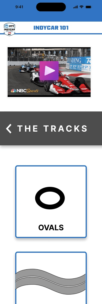
Visual breakdown of track types, rules and flags
Redesigned layout for
better visibilty and interactivity
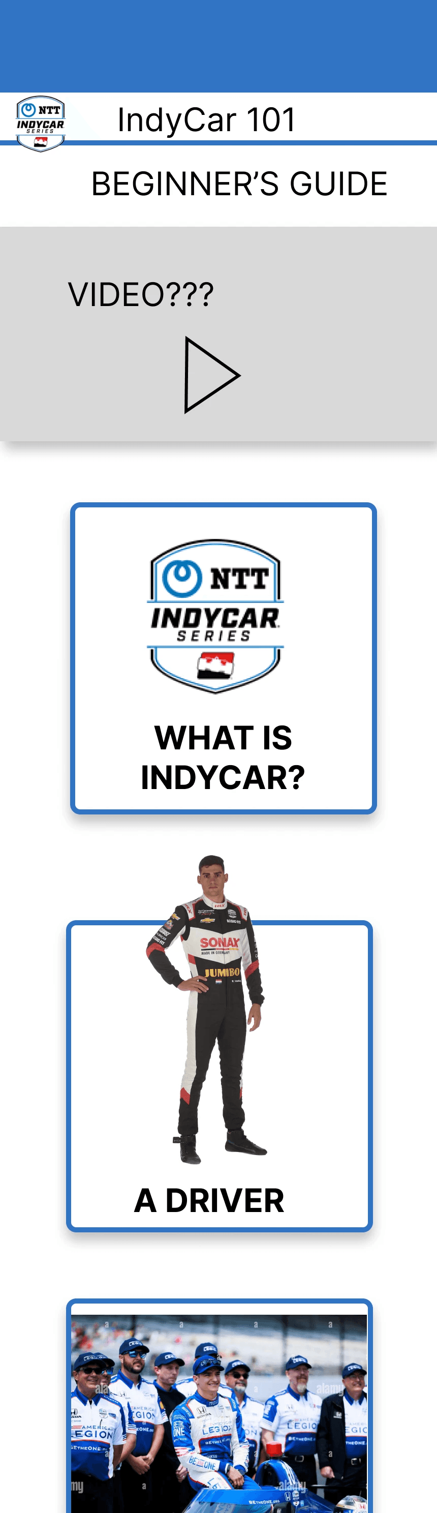
SPORT INTRODUCTION:
Highlight INDYCAR’s uniqueness
to spark interest.


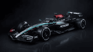
Interactive model of the race car

Exclusive BTS footage
of the teams

Driver Career
Timeline
Exclusive Driver
footage & Stats


Iteration 2:
🔹 Optimized Information Density: Redesigned layout for quicker interactions, maximizing content visibility.
🔹 Rich Visual Integration: Embedded videos and infographics, reducing text-heavy sections.
🔹 Enhanced Interactivity: Added swipeable car breakdowns, interactive race strategy guides, and
BTS (Behind-the-Scenes) content.


We went through two major design iterations, refining based on usability tests:
Iteration 1:
🔹 Maximized Information Density: Redesigned layout to display more content at a glance.
🔹 Rich Visual Integration: Replaced text-heavy sections with images and videos for better engagement.
🔹 Interactive Personalization: Introduced interactive elements to tailor the user experience.
✅ Anatomy of a Race Car → Interactive exploration of car mechanics.
✅ Race Rules & Track Guides → Visual breakdowns of flags, track types, and strategy insights.
✅ Behind-the-Scenes (BTS) Content → Exclusive footage of pit crews, engineers, and race-day prep.
✅ Team & Driver Profiles → Personalized stories and career stats to build fan loyalty.
Final Design Enhancements:
Key Learnings
💡 Strategic Planning: Balanced business goals with UX objectives to ensure a scalable design approach.
💡 Stakeholder Influence: Worked closely with INDYCAR executives, aligning UX solutions with business needs.
💡 Data-Driven Design: Leveraged user testing insights to drive every iteration decision.
💡 Cross-Functional Leadership: Collaborated with marketing, and design teams for seamless execution.
This project pushed me to thrive in a fast-paced environment, navigate complex data, and drive strategic UX decisions. It strengthened my ability to:
Advocate for UX in business discussions.
Influence cross-functional teams & stakeholders.
Design for long-term engagement and retention.
3D Interactive Race Car Model
Expanded Video Content
More BTS Footage
Next Steps
Impact: UX & Business
We validated our designs through User Testing, Heuristic Evaluation, Cognitive Walkthroughs, and Stakeholder Feedback.
💬 One fan summed it up perfectly:
30%
Increase in session duration
25%
Drop in bounce rates
4.9/5
Stakeholders rated the approach
4.8/5
System Usability Score (SUS)
85%
Users preferred the new interactive features


If You Like What You See...
Powered by Curiosity, Late Nights, and Endless Iterations
© Karthik Anupindi 2025